
scale visualizer
This web-based tool designed to help students quickly and effectively learn scales on keyboard instruments (piano, xylophone, etc.). Originally conceived as a memory aid for students struggling with the keyboard layout, the tool evolved into a flexible practice resource.
Audience: Percussion students at Suffolk County Community College
Responsibilities: Visual design, UI design, prototype creation, audio editing
Tools used: Articulate Storyline, Figma, Google Suite, Adobe Photoshop, Audacity, ChatGPT
The Problem
Many percussion students at Suffolk enter college with little to no keyboard experience. Because keyboard skills are tied closely to music theory, a required course, students needed to master scales quickly to succeed in coursework and assessments. For this reason, a solution was needed that would:
Accelerate student familiarity with keyboard layouts.
Support scale learning as a foundation for music theory.
Improve performance on required semester assessments.
The solution
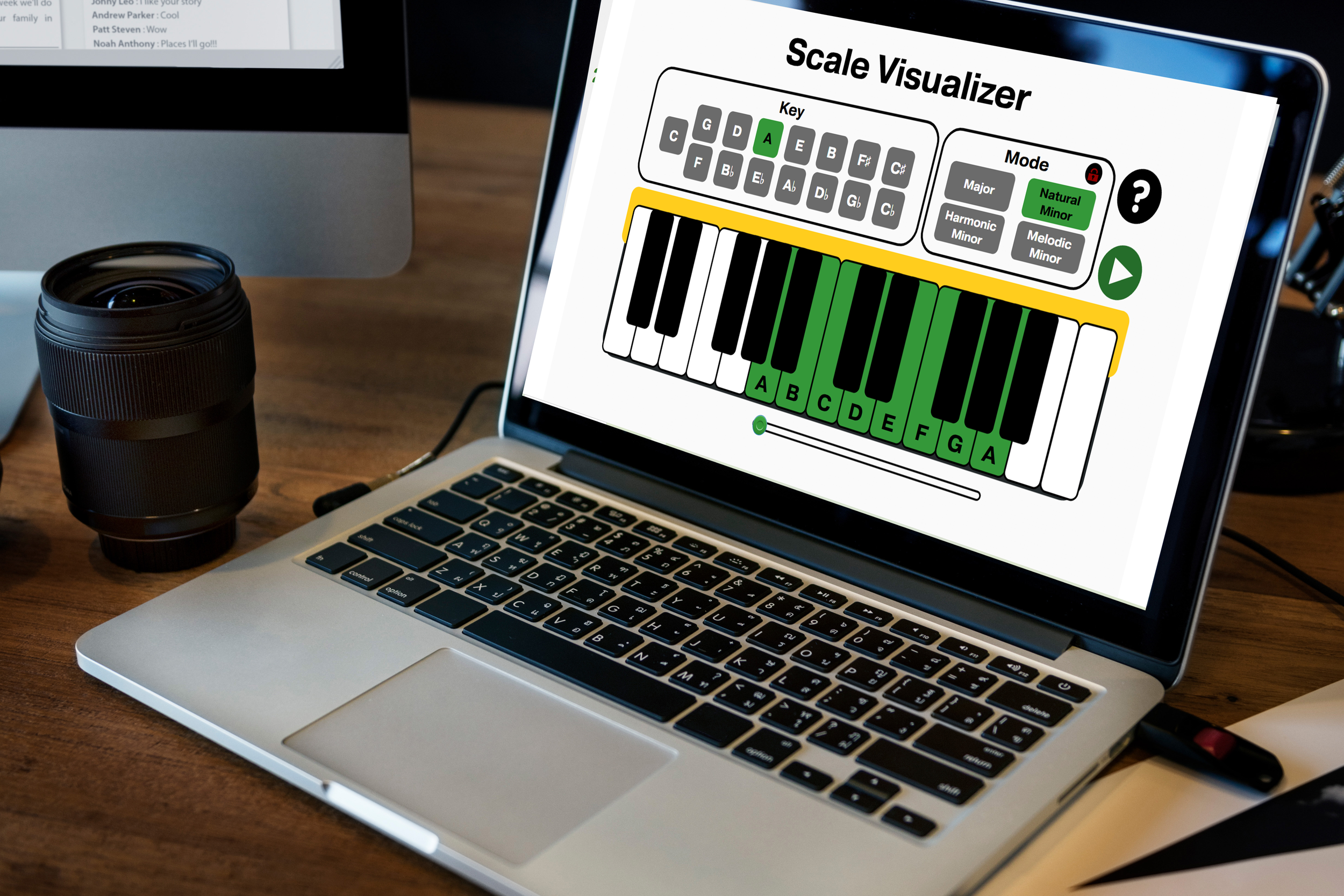
The final solution is a stand-alone, web-based tool that allows students to see how the notes of any given scale are arranged on the keyboard. This solution was the best choice, as it can function as a tool in instructor-led training sessions, while also being available as a resource for students practicing on their own.
My Process
In order to build the best possible solution, I followed the ADDIE Model. I started by analyzing the needs of the learners by evaluating assessment data patterns and speaking directly with the people who would use the solution. I settled on the idea of a web-based tool that could be accessed at anytime, allowing for spaced practice. I designed an interface which had ease of navigation and use, and then developed the project using a variety of software tools. I implemented the solution with the learners at Suffolk Community College, as well as sharing it with peers online. I evaluated the results and feedback I received, and made adjustments as needed.
Visual Mockups
In order to figure out the most intuitive layout for the experience, I started by designing the interface in Figma, which allowed me to streamline the design process. I went through a few iterations, trying to combine a sleek and navigable user experience with clear interfaces that would also show the relationship of the keys through the circle of fifths.
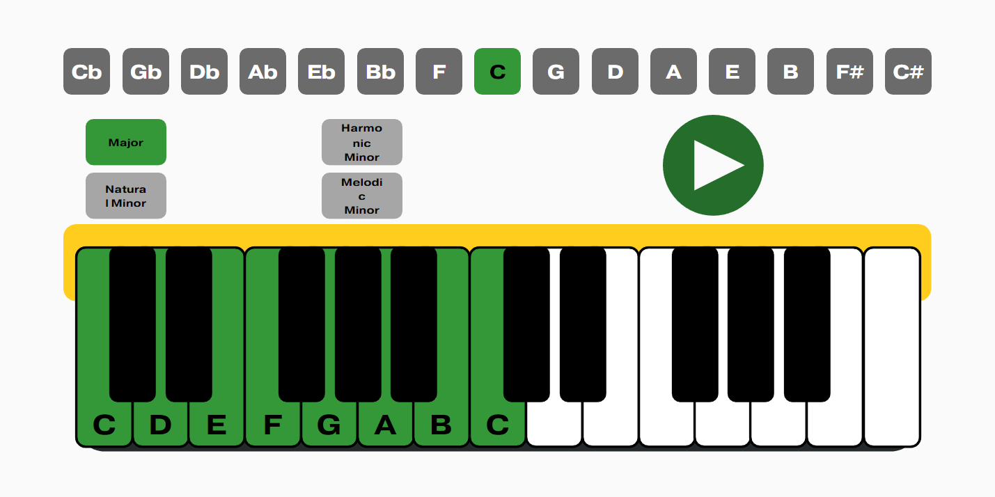
The first iteration of the interface design.
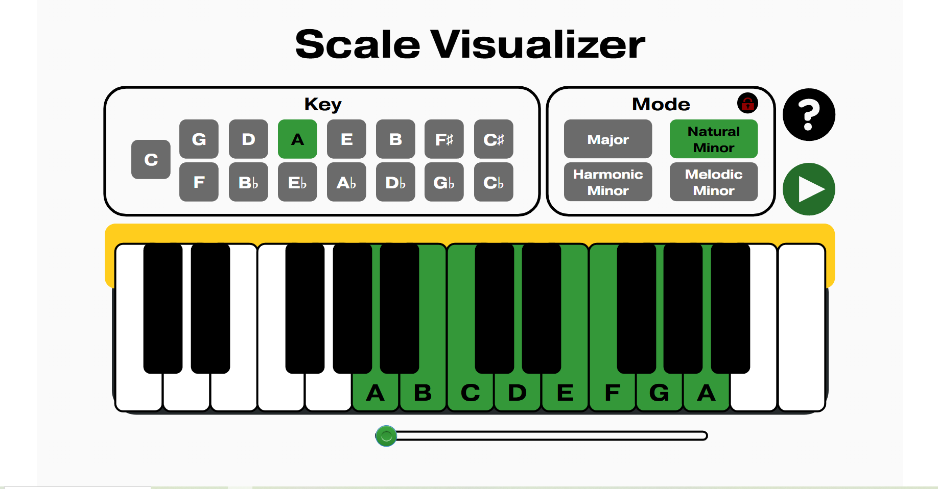
The final design of the tool.
Interactive Prototype
Once a design had been finalized, I began building the tool in Storyline. In order to support multiple modes of interactivity, I programmed the tool to allow for users to click each key individually, have the scale played automatically with the play button, or slide up and down on the scale with the slider. The original prototype included three keys, each with four modes. I shared the prototype online with peers and received a great amount of positive feedback.
Full development
Finally, I built out the project to include each key and mode. I also added a tutorial to support learners who needed more support to make full use of the tool. I shared the project with the percussionists and faculty at Suffolk County Community College, as well as peers online, and received a great deal of positive feedback, primarily about the clarity of information and the ease of navigation.
Results
Building the scale visualizer has been a gratifying and fun process. It allowed me to blend my skills as an instructional designer with my experience as a music educator, creating an online tool that can help learners at anytime and any place. As a result of implementing this tool, learners performance on mid and end of semester assessments have increased by 10%.
TAKEAWAYS
Keep it simple: The biggest challenge with the Scale Visualizer was programming it in the most efficient way possible. Due to all of the interactive and automatic elements of the project, the tool used a lot of triggers and states. Multiple times throughout the build, I found there was a much simpler way to program an interaction. Through this I learned to always keep Occam’s Razor in mind: the simplest solution is often the best.
The first solution isn’t necessarily the best: When I first began building this project, it was intended to help learners memorize the notes on the keyboard. The project stalled after showing it to a few people, who reported that they didn’t feel that the tool was giving them the practical hands-on knowledge they needed to actually play piano. The idea of using it as a visual practice aide rather than a memorization tool came much later, but ended up being far more effective and solved a real issue I was facing in my work.
Next steps
Piano fingerings: In keeping with the original idea of using this tool as an aide in teaching piano, I would expand the functionality to include the option of seeing the fingering numbers used to play each note of the scale, rather than the notes themselves. This would allow for the tool to be more versatile and address a wider range of learner needs.
Assessment mode: The current iteration of the tool does a good job of presenting the learner with the material they need to practice. The one thing it does not do is assess whether the learner can perform the scales without the visual aide of the tool. In a future version, I would expand the tool to include an assessment mode, where the learner has to click the correct keys in order on the keyboard, and receive feedback on how accurately they performed.